
Table of Contents
- Modern Interior Wall Art Trends Shaping 2026
- Large Wall Art for Living Room Spaces
- Abstract Wall Art Trends Dominating Modern Interiors
- Gallery Wall Ideas That Feel Curated, Not Cluttered
- Wall Mural Ideas for Statement Feature Walls
- Materials, Durability and Renter-Friendly Options
- Room-by-Room Recommendations and Budget Guidance
- Frequently Asked Questions
Last Updated: October 5, 2026
Modern Interior Wall Art Trends Shaping 2026
Modern interior wall art trends in 2026 favour scale, texture and materials that look and feel considered rather than mass-produced. This guide from Pixel Perfection, based on our work printing directly onto brick, timber and concrete across Sussex, breaks down the looks worth planning around this year, plus the practical decisions that make them work.
Two shifts define the year. First, homeowners are moving away from small, evenly spaced frames toward one large statement piece. Second, texture is doing the heavy lifting.
RIBA guidance on interior design and specification
Below, we cover the trends, the wall art ideas behind them, and the sizing rules that stop a good concept from looking wrong on the wall.
Why Scale and Placement Matter More Than Ever
Most disappointing wall art fails on scale, not on taste. A piece that is too small leaves the wall looking unfinished, no matter how good the design is.
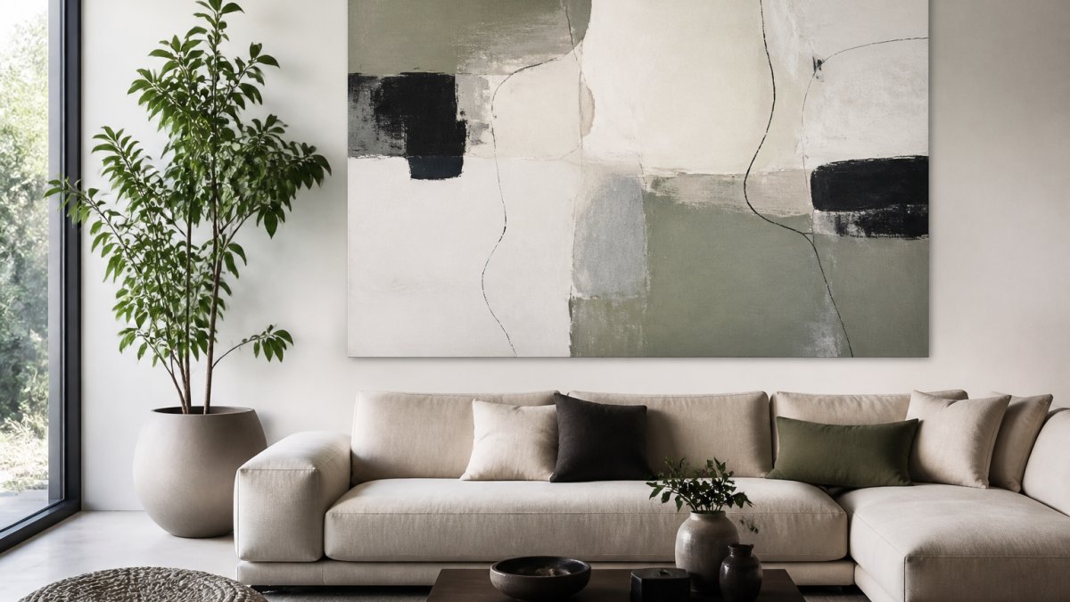
The fix is a simple rule: aim for artwork that covers roughly two-thirds to three-quarters of the width of the furniture below it.
Placement matters just as much. Hang art so its centre sits at eye level, around 1.45 to 1.55 metres from the floor.
Measure your wall and your furniture before you choose a design. Most people buy art first and then discover it is 40 centimetres too narrow for the space.
Large Wall Art for Living Room Spaces
Large wall art for living room walls works best when it fills the space above the main seating area without crowding it. One generous piece almost always beats a cluster of small ones.
Choosing the Right Dimensions for Your Wall
| Wall Width | Furniture Below | Artwork Width | Height From Floor |
|---|---|---|---|
| 3 m | 2-seat sofa | 1.4-1.6 m | 1.45-1.55 m |
| 4 m | 3-seat sofa | 1.8-2.2 m | 1.45-1.55 m |
| 5 m+ | Corner sofa | 2.4-3 m | 1.45-1.55 m |
For larger rooms, a single oversized piece reads as more confident than several medium ones. If your wall is very wide, split the design into two matched panels rather than shrinking the concept.
Abstract Wall Art Trends Dominating Modern Interiors
Abstract wall art trends this year lean toward soft, organic shapes rather than sharp geometry. Think flowing lines, layered colour and a sense of movement. Warm neutrals, clay tones and deep greens are replacing the cool greys of recent years. Bold colours still work, but they now appear as one or two accents inside a calmer palette rather than across the whole wall. Geometric patterns have not disappeared either, they have simply softened, with rounded forms replacing hard angles.
What separates a considered abstract piece from a generic one is not the style label but how the composition behaves at scale. A few things worth checking before you commit:
- Focal weight: where does the eye land first? A single dominant mass reads as intentional; three competing masses read as busy.
- Edge treatment: hard-edged shapes feel architectural and suit modern, minimal rooms. Soft, feathered edges feel painterly and sit better with traditional furniture.
- Negative space: roughly a third of the composition left open gives the design room to breathe on a large wall. Fully saturated, edge-to-edge designs can overwhelm a small room.
- Direction of movement: horizontal flow widens a narrow room; vertical flow lifts a low ceiling.
Matching Abstract Work to a Room’s Existing Palette
A common pattern is to pull one accent colour from the artwork and repeat it once elsewhere in the room, a cushion, a lamp base, a rug border.
If your room is already neutral, an abstract piece can carry the colour. If your room is already colourful, choose an abstract work in tonal variations of one hue so the wall does not compete with the furniture.
Why Abstract Works Well Without a Frame
Abstract designs tolerate frameless presentation better than figurative or photographic work because there is no subject to crop or protect. Printed directly onto a textured surface, the design becomes part of the wall itself, and the wall’s own grain or brick pattern shows through the lighter areas of the composition. That interaction is difficult to replicate with a canvas or a framed print, and it is one of the reasons direct-to-wall methods suit abstract work particularly well.
Before ordering, view the design at the actual size on your wall. A composition that looks balanced on a screen can lose its focal point once it is 2 metres wide.
Gallery Wall Ideas That Feel Curated, Not Cluttered
Gallery wall ideas succeed when they follow one clear rule and break it once. A single grid with one off-centre piece looks intentional. A random spread looks like clutter.
A few approaches that work:
- The tight grid: equal spacing, equal sizes, calm and ordered
- The salon hang: mixed sizes, shared centre line, classic and rich
- The shelf method: art resting on a picture ledge, easy to swap
- The anchor piece: one large work with two or three smaller companions
Keep gaps consistent, around 5 to 8 centimetres. Pick a theme, colour or subject, and let everything else vary.
Do not mix more than three frame finishes on one wall. It reads as accidental rather than collected, and it undercuts the whole arrangement.
Wall Mural Ideas for Statement Feature Walls
Wall mural ideas turn a single wall into the focal point of a room. The strongest murals use one image or pattern at full scale rather than many small elements.
Popular directions include oversized botanical art, tonal landscapes, and repeating line work that follows the architecture of the room. In hospitality and retail spaces, murals often carry a brand story across an entire wall.
Direct-to-Wall Printing as a Modern Alternative
Direct-to-wall printing is a method of applying a design straight onto a prepared wall surface using a digital printer, with no paper, vinyl or panels involved.
This matters for anyone who has spent years getting a brick or timber surface just right. There is no wallpaper to remove, no mess and no downtime. The finish keeps the texture of the wall underneath.
UK government guidance on waste and responsible disposal
Materials, Durability and Renter-Friendly Options
Durability comes down to the surface and the ink, not the design. UV-cured pigment resists fading far better than standard print, and it holds up on porous surfaces like brick, timber and concrete.
For renters, the priority is reversibility. Options range from removable panels and fabric hangs to direct printing on a board that can be taken down and moved. If you rent, check your tenancy agreement before committing to anything fixed.
A quick comparison:
| Option | Best For | Reversible | Handles Texture |
|---|---|---|---|
| Canvas or framed print | Renters, quick changes | Yes | No |
| Peel-and-stick panels | Short-term lets | Yes | No |
| Direct-to-wall printing | Homeowners, venues, retail | No | Yes |
Match the method to the wall, not the other way around. Textured brick and rough concrete need a process built for them, which is where direct printing pulls ahead of vinyl.
Room-by-Room Recommendations and Budget Guidance
Different rooms call for different approaches, and the same trend can look wrong in one space and right in another. Here is how we would plan each room, with the dimensions and placement rules that make the difference.
Living Room
One large abstract or landscape piece above the main sofa is still the strongest move. Aim for artwork covering roughly two-thirds to three-quarters of the sofa width, around 1.8 to 2.2 metres for a three-seater. Hang the centre at 1.45 to 1.55 metres from the floor, leaving 15 to 25 centimetres between the sofa back and the bottom edge. If the wall is very wide, split the design into two matched panels rather than shrinking the concept.
Bedroom
A calm tonal mural behind the headboard works better than a framed piece because it does not need to be centred on the bed’s exact width. Keep the palette low-contrast, deep greens, warm greys, soft clay, so the wall recedes rather than competes. Leave at least 20 centimetres between the top of the headboard and the bottom of the design. Avoid high-contrast geometrics here; they tend to feel restless in a room meant for rest.
Hallway
Hallways are usually narrow and tall, so a vertical design draws the eye upward and makes the space feel less compressed. A tall, narrow panel or a full-height mural on the end wall works well. Because hallways are often poorly lit, choose a design with enough tonal variation to read in low light, very subtle, low-contrast work can disappear entirely.
Home Office
A bold geometric panel behind the desk gives the room a focal point that reads well on video calls. Position it so the top third of the design sits behind your head rather than directly behind your face. Mid-contrast patterns work better than very busy ones, which can distract on camera.
Retail and Hospitality
A full-wall brand mural is the standard approach for impact, but the practical constraint is usually downtime. Direct-to-wall printing avoids the strip-out and re-papering cycle that a traditional mural install requires, which matters for venues that cannot close for a week. Plan the design around fixed elements, sockets, signage, door frames, rather than treating the wall as a blank canvas.
Budget Guidance
Pricing for wall art depends on three variables: wall area, surface preparation, and design complexity. A large, textured or uneven wall takes longer to prepare than a smooth plastered one, and a detailed multi-colour design takes longer to print than a simple two-tone composition.
As a rough guide to how the options compare:
| Option | Typical Cost Driver | Best For |
|---|---|---|
| Framed or canvas print | Size and frame finish | Renters, quick changes, smaller walls |
| Peel-and-stick panels | Panel count and wall prep | Short-term lets, smooth walls |
| Direct-to-wall printing | Wall area and surface condition | Homeowners, venues, textured walls |
For a single statement wall, most homeowners find the cost of a large framed piece and a direct-printed wall are closer than expected once framing, hanging and future replacement are factored in.
Plan the room first, then the artwork. Decide the wall, the furniture position and the lighting, then choose a design that fits those constraints, not the other way around.
Which? guidance on hiring tradespeople and getting quotes
Frequently Asked Questions
What are the current trends in wall art?
Modern wall art in 2026 leans toward oversized abstract pieces, geometric patterns and textured surfaces. Bold colour palettes are replacing neutral-only schemes, and 3D wall panels add sculptural depth. Botanical art and handcrafted pieces remain popular for adding warmth. Murals and direct-to-wall printing are gaining ground as alternatives to framed canvas, particularly for feature walls in homes and commercial venues.
How do I choose the right size wall art for a wall?
A common guideline is to choose art that covers roughly two-thirds to three-quarters of the wall width above a sofa or console. For a large wall art for living room setting, measure the furniture below and allow 15-25 cm of space on each side. If the wall is very tall, consider a vertical arrangement or a floor-to-ceiling mural to avoid a floating look.
Are textured wall art and murals still in style?
Yes, texture and murals are very much in style. Contemporary interiors favour sculptural surfaces, 3D wall panels and handcrafted finishes that add depth. Wall mural ideas now include large-scale botanical scenes, abstract washes and geometric designs printed directly onto brick, timber or concrete. Direct-to-wall printing preserves the original surface texture, which keeps the finish looking authentic rather than flat.
How do you arrange multiple pieces of wall art?
Start with a focal point, usually the largest piece, and build outward. Keep 5-8 cm between frames for a cohesive gallery wall. Align the centre of the arrangement at eye level, roughly 145-150 cm from the floor. For a modern look, try a grid layout with equal spacing, or mix sizes in a salon-style cluster. Test the arrangement on the floor or with paper templates before hanging.
Choosing wall art that suits your space is harder than it looks, and the wrong method can mean damage you cannot undo. Pixel Perfection solves that with direct-to-wall printing using UV-cured pigment, high-precision vertical robotics and finishes that preserve the natural texture of brick, timber and concrete. Get started with Pixel Perfection and turn your wall into a bespoke piece made for the room it lives in.