Office wall graphics can turn a blank reception, corridor or meeting room into a space that feels unmistakably yours. But a strong design is only part of the result. The wall, the way people use the room and the installation plan all matter.
Avoid these seven common missteps and your graphics can look considered, communicate clearly and fit the space properly.
1. Designing before measuring the wall
A graphic can look perfect on a screen and still land awkwardly on site. Doors, sockets, switches, radiators, furniture and wall edges can interrupt a design or hide important details.
The fix: Start with a site survey. Measure the printable area and note nearby features, furniture and the main sightlines. Consider what people see when they enter, approach reception or sit at a meeting table. Final artwork should be scaled to the actual wall, not an approximate measurement.

2. Assuming every surface is ready to print
Dust, damp, loose paint and uneven surfaces can affect the finish. Even a clean-looking wall may have patches or texture that change how artwork appears.
The fix: Check the wall condition before approving artwork. Identify the surface (such as painted plaster, brick, wood or glass) and confirm that the chosen print method is suitable for it. Repair unstable areas and follow any preparation or paint-curing recommendations before installation.
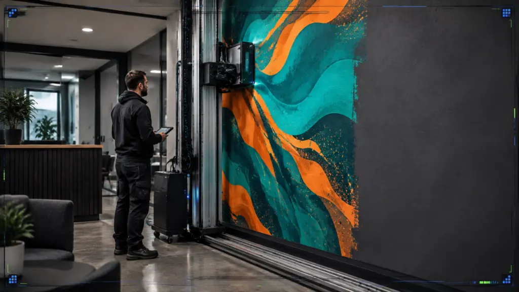
Direct-to-wall printing applies the image straight to a suitable surface, without wallpaper seams or a separate vinyl layer. The wall still needs to be assessed: suitability depends on its condition and texture.

3. Choosing artwork that is hard to read from a distance
Small text, intricate details and low-contrast colours can disappear across a large room. A graphic might look clear when viewed on a laptop, yet be difficult to make out from the reception entrance or the back of a meeting room.
The fix: Design for the viewing distance. Keep copy concise, use clear type and test colour contrast in the actual lighting. Step back from a proof or on-screen mock-up to judge how it reads at a realistic scale.
If the wall needs to guide visitors, make the message immediate. A short direction or clear room name is easier to follow than a block of explanatory text.
4. Letting the graphic compete with the room
A wall covered in logos, slogans and busy imagery can feel cluttered rather than branded. The same can happen when a vibrant feature wall sits beside furniture, displays or other visual details that demand attention.
The fix: Decide what the wall needs to do first. Is it introducing your brand, setting a mood, telling your story or helping people find their way? Give that purpose visual priority. One strong focal point can make more impact than several competing messages.
Use brand colours and type consistently, then leave enough breathing room for the design to sit comfortably within the interior.
5. Forgetting doors, edges and interruptions in the design
An image can lose its impact if a key detail falls across a doorway, around a corner or behind a cabinet. With panel-based graphics, unplanned joins can also split a face, word or logo.
The fix: Plan the artwork around the wall’s real boundaries and features. Keep important content clear of doors, switches and edges. If the design uses multiple panels, agree the layout and join positions before production. Pixel Perfection can help with digital file preparation and scaling so artwork is matched to the dimensions of the space.
For a wall-printing overview, see our guide to custom office wall graphics and murals.
6. Treating decorative graphics as safety or wayfinding signs
A mural can add character, but it should not make essential information harder to see. Busy patterns near doors, emergency equipment or directions can compete for attention. Decorative graphics are not a substitute for required safety signs.
The fix: Keep existing safety information visible and easy to understand. Plan decorative artwork around signs, exits and important controls rather than over or behind them. For wayfinding, use clear wording and recognisable symbols, and check that people can read the information from where they need it.
The HSE’s guidance on safety signs explains that signs should be clear and legible. Accessibility needs matter too: the Equality and Human Rights Commission’s guidance on physical barriers includes signs among the features employers may need to consider. Requirements depend on the building and its use, so check the applicable guidance for your project.

7. Leaving maintenance and future changes until later
A graphic’s job does not end on installation day. Offices change: furniture moves, rooms are repurposed and walls need cleaning. If you have not considered aftercare, the artwork may become harder to maintain or less useful as the space evolves.
The fix: Think about how the area will be used. A quiet meeting room has different demands from a busy corridor or reception. Ask about suitable cleaning and surface care, and keep a record of the artwork file and wall dimensions. If you expect your branding to change, make that part of the brief from the start.
Direct-to-wall printing uses instant UV curing, so the printed image is ready immediately after the process. The method also avoids the seams, paste and peeling edges associated with some wall coverings. For more on the options, read direct-to-wall printing vs wallpaper.
A quick checklist before you approve the design
Before production, check that you have:
- Measured the wall and noted doors, fittings and furniture.
- Confirmed the wall surface is suitable and properly prepared.
- Reviewed the artwork at the intended viewing distance.
- Kept key details clear of edges, joins and obstructions.
- Preserved the visibility of safety information and wayfinding.
- Considered cleaning, wear and possible future changes.
From blank wall to considered workspace
The best office wall graphics do more than fill an empty surface. They bring your brand into the room, create a clear focal point and help the space feel intentional.
Pixel Perfection provides bespoke direct-to-wall printing for offices and other commercial interiors across West Sussex and Sussex. Our team can help assess your wall, scale your artwork and print it directly onto suitable surfaces using precision digital equipment.
Have a wall in mind? Share your idea with Pixel Perfection and we’ll help you explore what could work.