
Best Printed Wall Graphics for Offices in 2026
A facilities manager tapes out a meeting room wall while the late-afternoon light from a Sussex office window catches a stack of colour swatches on the desk. The line looks right from one angle, wrong from another. Someone steps back, squints, and realises the wall is doing half the design work already.
That is usually where good office projects start. If you are comparing printed wall graphics for a Brighton reception, a Crawley boardroom, or a Worthing corridor, the best choice depends less on trend and more on the surface, the lease, and how hard the room gets used from Monday morning to Friday evening.
This guide is for office managers, business owners, landlords, and fit-out teams who want a polished result with minimal disruption. We will look at the main design considerations you are likely to weigh in West Sussex and Sussex, then compare them on finish, colour impact, and suitability for the room.
Selection criteria for office printed wall graphics in 2026
Before you judge the artwork, judge the conditions. A brilliant design on the wrong wall will still look second-rate. In offices, the right call usually comes down to three practical checks first.
Watch This Helpful Video
To help you better understand printed wall graphics, we’ve included this informative video from edgykatrina. It provides valuable insights and visual demonstrations that complement the written content.
Wall surface and finish
Smooth, clean, fully cured painted walls generally give a better result than dusty, damp, or heavily textured surfaces. That sounds basic, but it is where plenty of projects wobble. If you have patched plaster, flaky paint, or a wall that was only painted last week, ask for a prep check and a small test area before anyone commits to full production. A meeting room in Horsham with fresh matt emulsion is a very different starting point from a rough stairwell wall in an older Chichester building.
Project timing and visual longevity
If you want the wall to support a brand refresh, a client-facing area, or a more settled interior scheme, think about how long the image needs to last and how the room will be used. Timing matters too. A busy reception may need a coordinated production schedule, while a quieter back office can be handled with less disruption.
Cleaning, lighting, and brand visibility
Matte finishes reduce glare under office lighting, while glossier finishes can look sharper but reflect more. That trade-off shows up fast under LED downlights, south-facing windows, and polished floors. You also need to think about how close people stand to the wall. Graphics seen from 50 centimetres need cleaner detail than a feature wall viewed from 6 metres across an open plan workspace. Corridors, kitchens, and printer areas also need finishes that can handle routine wiping.
If the wall fails the prep check, no design choice will save it.
| Check | Why it matters | What usually suits it |
|---|---|---|
| Surface condition | Affects adhesion, seams, and overall finish quality | Smooth cured paint suits bespoke wall prints and printed decor; echo-prone or uneven spaces may suit a different artwork layout |
| Project timing | Determines how the work is planned and delivered | Short deadlines often point to simple, well-prepared print production |
| Lighting and cleaning | Changes glare, colour perception, and day-to-day maintenance | Matte or low-glare finishes for bright rooms; durable surfaces for wipe-clean areas |
#1 Bespoke printed wall murals
Summary: This is the strongest choice for instant brand impact across one dominant surface. Best for: reception walls and hero spaces.
Best for reception walls and hero spaces
If you want visitors to understand your brand before anyone says hello, bespoke printed wall murals are hard to beat. They can turn a blank reception wall into a launch statement, a skyline graphic, a product story, or a culture wall in one move. In a Brighton agency lobby or a Gatwick-adjacent office entrance, that sort of visual shorthand works fast.
Why bespoke printing works so well indoors
Bespoke wall prints can be produced in full colour with carefully scaled artwork, brand visuals, or pattern repeats. That gives you a lot of design freedom without needing a complex build. A professionally produced print usually makes it easier to create a polished, durable result in busy offices, which is why it remains such a common choice for branded environments.
What to check before production
Bespoke wall graphics perform best when the wall is smooth, well-prepared, and measured accurately. You also need to plan around sockets, thermostats, skirting lines, and joins. If the design spans several sections, ask how the artwork will be set out and whether it has enough bleed. A strong single mural often beats a weaker attempt to cover every wall in the room.
One strong wall often does more for an office than covering every surface.
#2 Cut vinyl lettering and logo graphics
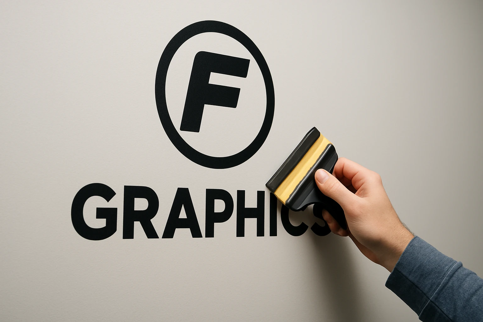
Summary: This is the cleanest choice for concise branding and wayfinding where readability matters more than imagery. Best for: logos, arrows, and short slogans.
Best for logos, arrows, and short slogans
Cut graphics are ideal when you need to say one thing clearly. Think company logos behind reception desks, room names along a corridor, directional arrows near stair cores, or a short line of brand language on a glass partition. In offices where visitors need to find meeting rooms quickly, typography usually does a better job than decorative art.
Why it feels modern and uncluttered
Because it leaves the wall visible, cut lettering tends to feel light and architectural rather than heavy. That suits painted walls, glazed screens, and entrance zones where you want branding without visual noise. In smaller offices around Haywards Heath or Littlehampton, that restraint can make the space feel more considered.
Where it is less effective than a full mural
This format is not built for atmosphere. It handles wayfinding, identity, and short messages very well, but it will not create the same immersive effect as a full printed scene or pattern. On a large blank wall, lettering alone can sometimes feel underpowered unless the scale is generous and the typography is handled with confidence.
If people need to find their way quickly, legibility should win over decoration.
#3 Custom wall art panels
Summary: This is a flexible option for offices that want a softer interior-design feel with a tailored finish. Best for: leased offices and short-term refreshes.
Best for leased offices and short-term refreshes
If you want the warmth of wall art without overcommitting to a full refit, custom wall art panels make sense. They suit speculative offices, rented studios, and businesses testing a new look before a larger interior update. For a leased workspace in central Brighton, that flexibility can be the difference between doing the project now or postponing it indefinitely.
How it differs from a standard poster or framed print
Custom wall art gives you a more tailored result than an off-the-shelf poster, because the scale, image, and finish can be chosen for the space. Visually, it can feel softer and more decorative than standard corporate graphics, which is why it works well in breakout zones, hospitality-style meeting rooms, and wellness-led office schemes.
Care, cleaning, and finish considerations
As with other wall graphics, the wall still needs to be smooth, dry, and properly prepared. These pieces are a good fit when you want a more considered look, but they are not a free pass on planning. Ask how the artwork handles routine wiping, how the finish reads under office lighting, and what the image will look like at the viewing distance people actually have.
Temporary does not have to look temporary.
#4 Large-format printed wall art
Summary: This is the best pick when the room needs a strong visual identity as well as a cohesive interior look. Best for: boardrooms and open-plan offices.
Best for echo-prone rooms
Some spaces do not need more visual drama. They need a calmer, more settled feel. Large-format printed wall art is especially useful in meeting rooms, presentation spaces, training rooms, and open-plan offices where hard finishes can make a room feel stark. If every Teams call in your Crawley office feels visually unfinished, this option deserves serious attention.
How artwork and interior design work together
Printed wall art can carry brand colour, imagery, or messaging while still supporting the wider interior scheme. That means the wall can complement furniture, flooring, and lighting rather than fighting against them. Because the surface is usually chosen to suit the design, the room also avoids the harder, more clinical feel that some plain graphics can create.
When design consistency matters more than decoration
If the room needs to feel coherent, put the interior first. A well-resolved wall can be more valuable than a louder image with no relation to the rest of the space. This format is not always the cheapest upfront route, but it can solve two issues at once: appearance and cohesion. In practical terms, that often makes it money well spent.
In busy rooms, function should lead and the print should support it.
#5 Framed wall graphics
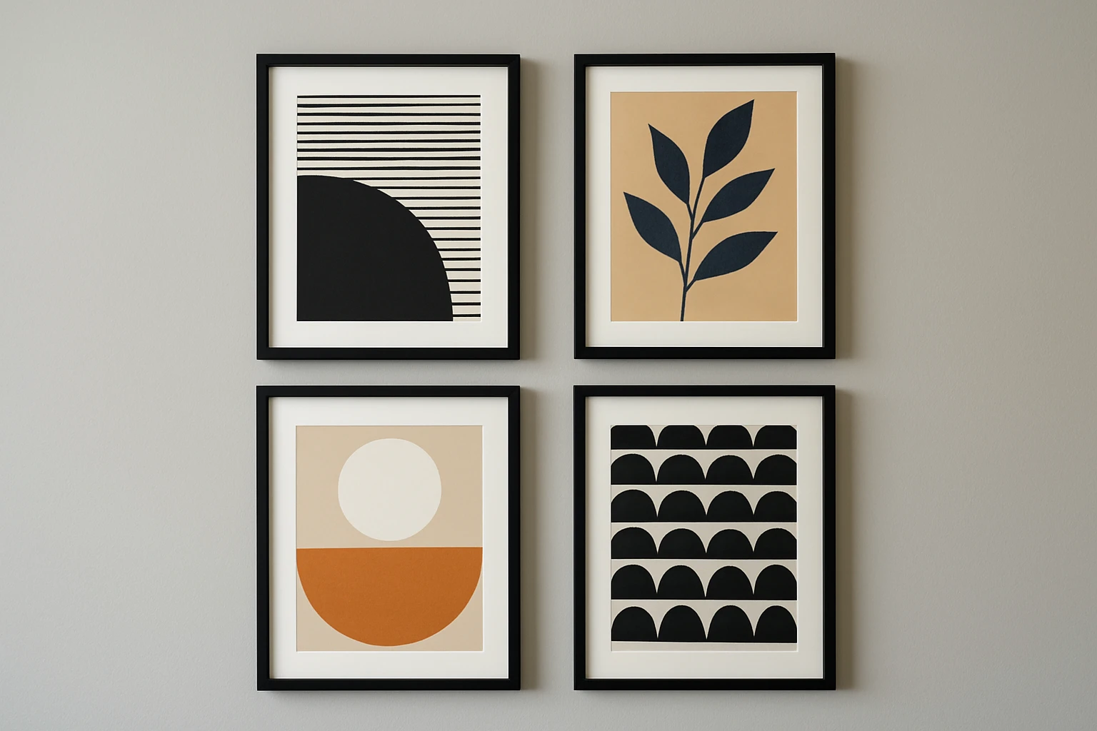
Summary: This is a premium-looking route for showcase spaces where a refined finish matters. Best for: upscale reception areas.
Best for upscale reception areas
Framed wall graphics sit well in offices that want a softer, more finished arrival experience. You often see them in headquarters receptions, show suites, and client-facing spaces where the brand needs to feel polished rather than loud. Large framed pieces can create a seamless, high-end look across a feature wall without the harsher read of a simple poster.
Why framing looks more finished under office lighting
Framed artwork often gives a more resolved appearance than an unframed piece. That helps in bright offices with spotlights, glazed entrances, or highly polished floors where reflections can flatten colour and distract from the image. It also tends to photograph well, which matters if your reception doubles as an event or recruitment backdrop.
Why it is easier to refresh later
Framed graphics are usually straightforward to update, which makes them useful when your campaign, messaging, or imagery changes. If your brand evolves, you can replace the artwork rather than redesigning the whole room. That makes this format useful for businesses planning phased rebrands or seasonal updates.
When lighting is unforgiving, a framed finish usually photographs better than a bare wall.
#6 Backlit wall graphics
Summary: This is the highest-impact option when the wall must stand out and carry the first impression. Best for: feature walls and lobbies.
Best for feature walls and lobbies
Backlit wall graphics are built for moments of arrival. They are common in reception zones, showcase spaces, and premium lobbies where you want the wall to feel memorable even in winter afternoons or windowless interiors. If a standard feature wall looks flat after 4pm, illumination may be the missing part of the brief.
Where illumination adds real value
Illuminated graphics use lighting behind the print to make colours appear brighter and more eye-catching. That added depth is not just decorative. It can help a reception zone feel more welcoming, make wayfinding landmarks clearer, and give branded content more presence in darker parts of the office. For visitor-facing businesses, that first impression can justify the added complexity.
Practical planning before the project
This type of installation needs careful planning and coordination. You need to know where the power goes, how maintenance access works, and whether the wall can physically take the system. It is a strong option, but it rewards early coordination with electricians, fit-out teams, and whoever manages the building fabric.
If the wall is there to sell the first impression, light should be part of the design.
How to choose the right printed wall graphics option
The best choice is usually the one that matches the room, the wall, and the lifespan you actually need — not just the nicest sample on a desk. Start by deciding what job the wall must do first, then let the finish follow.
Match the graphic to the room type
Reception walls reward boldness. Corridors reward clarity. Meeting rooms often reward calm. That sounds obvious, yet many office schemes still treat every surface as if it needs the same visual energy. A hero mural can transform a front-of-house space, while a quiet boardroom may be better served by a restrained art piece. Viewing distance matters too: close-up areas need sharper detail and cleaner finishes, while distant feature walls can handle broader layouts.
Balance budget, durability, and visual impact
The lowest upfront option can become the most expensive if the result feels underwhelming or fails to support the room properly. Kitchens, pinch points, and busy circulation routes need tougher visual planning than a lightly used executive room. Short projects usually push you toward simpler formats. Longer occupation can justify a more built-in look if it solves cleaning, branding, or replacement cycles better.
Ask for samples, mock-ups, and a production plan
Request scale proofs or mock-ups before printing so size and placement can be checked properly. Ask to see the material under your own lighting if you can. A matte sample that looks muted in a studio may feel perfect under strong office LEDs in Shoreham or Horsham. You should also ask for a production sequence: artwork prep, proofing, print time, finishing, and how snags around sockets or trims will be handled. If you are also weighing direct-to-wall printing, a local specialist such as Pixelperfection should be able to show a calibrated sample on a similar surface so you can compare edge detail and finish honestly.
Choose for the wall you have and the time you need, not the trend you saw last week.
| Option | Durability and cleaning | Visual flexibility | Glare profile | Acoustic benefit | Production notes |
|---|---|---|---|---|---|
| Bespoke printed wall murals | Good, especially with the right finish | High | Low to medium, depends on finish | None | Best on smooth prepared walls |
| Cut vinyl lettering | Good for low-contact areas | Moderate | Low | None | Fast, clean, excellent for wayfinding |
| Custom wall art panels | Moderate | High | Usually low | None | Good for leased spaces and refreshes |
| Large-format printed wall art | Moderate, depends on finish | High | Low | None | Great where a cohesive look is the real goal |
| Framed wall graphics | Moderate | Easy artwork swaps | Low | None | Premium look with replaceable artwork |
| Backlit wall graphics | Moderate | High impact | Light-controlled, visually bright | None | Needs power and access planning |
The best office graphics are the ones that fit the wall, the workload, and the brief — not just the mood board.
Start with the substrate, then the lighting, then the lifespan. Do that, and your printed wall graphics will still feel practical long after the launch-day photos are done.
Which wall in your office needs to work harder: the one greeting visitors, guiding staff, or setting the tone for the room?
Shape Better Interiors With Pixelperfection
Bespoke wall prints and custom wall art bring artwork, branding, and interior visuals to West Sussex and Sussex spaces with clean setup, precise scaling, and vibrant colour.
Generated on SEOPro AI